AmCraft Manufacturing
Web Designer/Developer
January - August 2021

AmCraft Manufacturing is a space management solutions company. They provide industrial curtain and track system solutions ranging anywhere from personal use to large scale distribution centers. These solutions may also encompass temperature control and sound absorption properties.
CODE
- + WordPress
- + Elementor
- + JavaScript
- + jQuery
- + HTML / CSS
- + PHP
DESIGN
- + Figma
- + InDesign
- + Product assembly
- + Photography
- + Photoshop
- + Responsive design
CHALLENGE
How do we convey AmCraft Manufacturing's customer service and product quality is the best in the industry?
BRAND IDENTITY
My first objective was to learn AmCraft Manufacturing's history. The discovery of "Am" being short for "American" lead to the eventually well received enhancements that would come to me in the following days.
LOGO ENHANCED
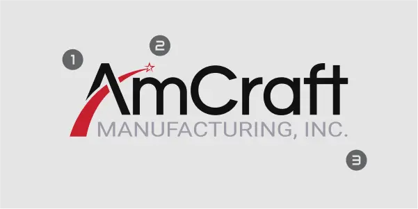
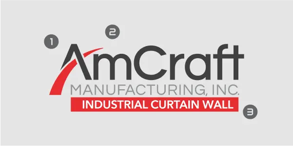
Logo Font
"AmCraft" and "MANUFACTURING" font families in the logo were unknown. I modified "MANUFACTURING" to Roboto to match what would come to be the primary font family. I also enriched the contrast of black and went with a warmer, more inviting, red.
FONT FAMILY
AmCraft was originally using the Futura font family. From my experience this font was a bit out of place from an industrial standpoint and not the most legible in larger blocks of text. I presented Roboto as an alternative, showing a side by side next to Futura and the clean, legibility of Roboto over Futura was very obvious and well received.
WEBSITE CONSOLIDATION
I was initially brought on the team to help enhance AmCraft's main website. Upon learning they had an additional 5 micro-websites, the Marketing Manager and myself had to persuade leadership to consolidate with a convincing presentation.
Leadership's previous resistance and hesitation stemmed from a history of website crashing, for reasons that left with former employees.
It was concluded with our PPC/SEO team that restructuring under the domain amcraftmanufacturing was the best long-term strategy.
I successfully organized and presented why consolidation leads to improved brand consistency, SEO, maintenance, cross selling opportunities, and total hosting/app cost.
Custom solutions are the majority of AmCraft's business. Items 1-5 represent custom solutions, 6 represents stock inventory shopping.
| BEFORE | AFTER |
|---|---|
| 1. amcraftindustrialcurtainwall.com | 1. amcraftmanufacturing.com |
| 2. amcraftmanufacturing.com | 2. /industrial-curtains |
| 3. insulatedcurtainwall.com | 3. /industrial-curtains/thermal |
| 4. acousticcurtainwall.com | 4. /industrial-curtains/acoustic |
| 5. datacenterenclosure.com | 5. /industrial-curtains/data-center |
| 6. industrial-curtain-wall.com | 6. /stock-products |
WEBSITE DESIGN
Upon website consolidation and sitemap approval, I had clearance to begin prototyping. I drew inspiration from large successful industrial distributors, competitors, and creative freedom. Feel free to checkout the interactive design in Figma below.
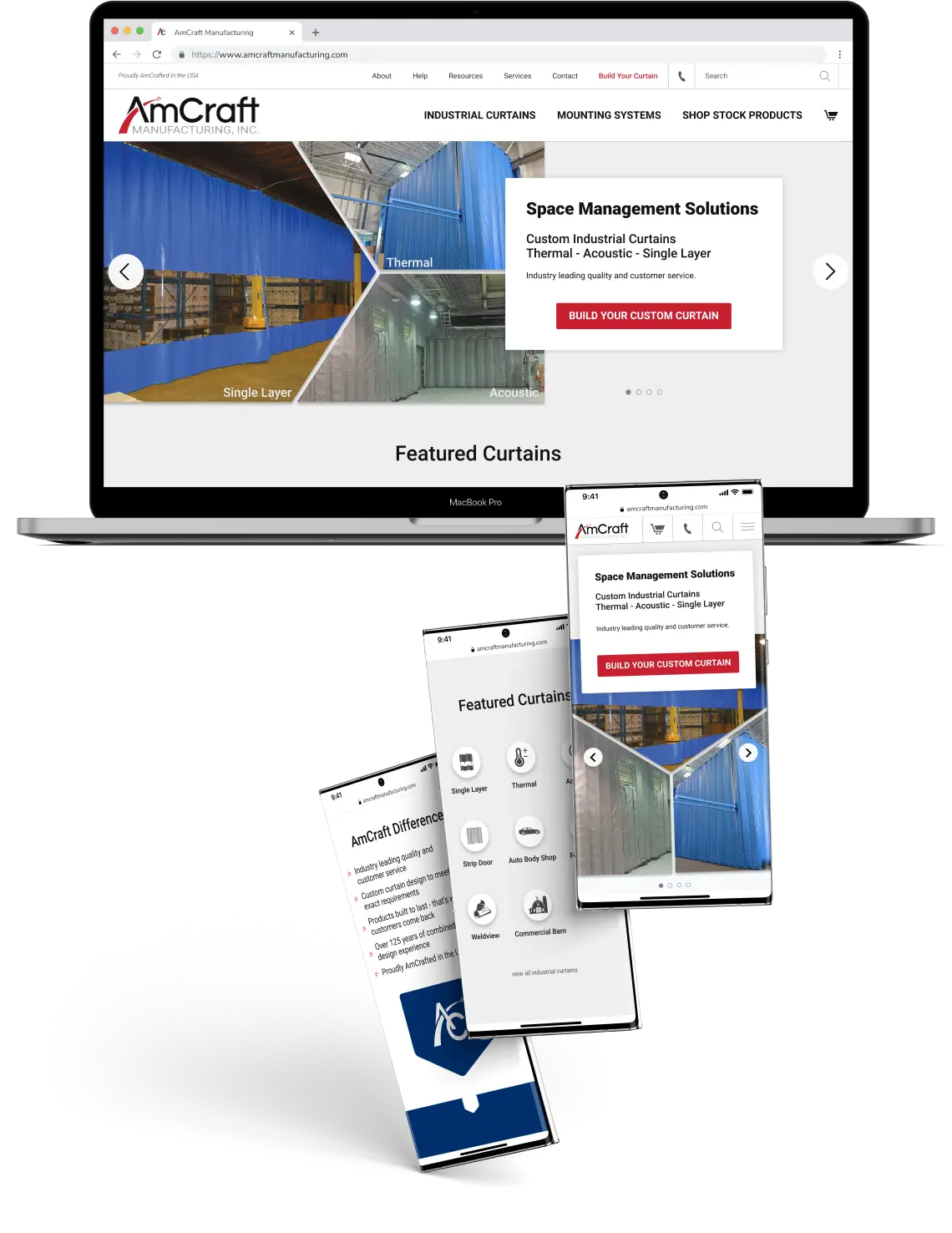 view interactive figma prototype
AMCRAFT DIFFERENCE
To convey AmCraft Manufacturing's customer service and product quality is the best in the industry, I conceptualized a minimal and wholesome concept - AmCraft Difference. This would be a short bulleted list that would, as modestly as possible, express why they were a superior brand.
SITE MAP
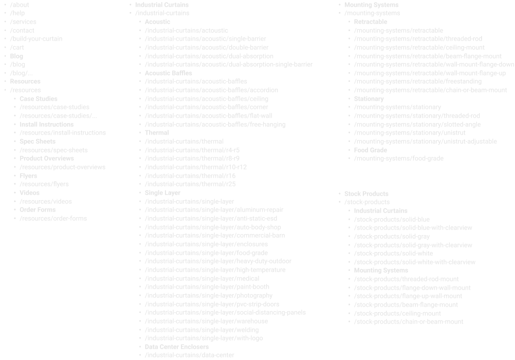
MENU
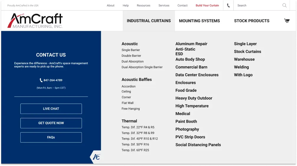
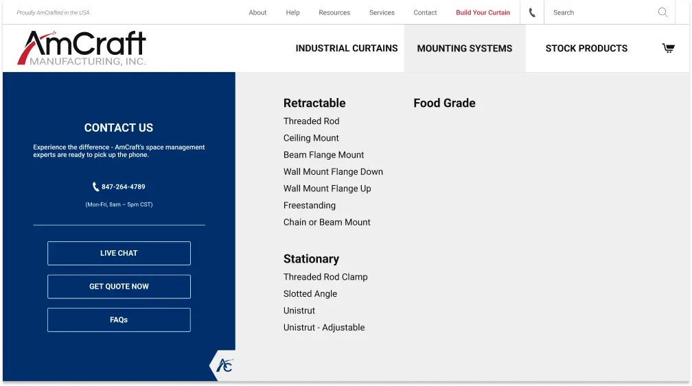
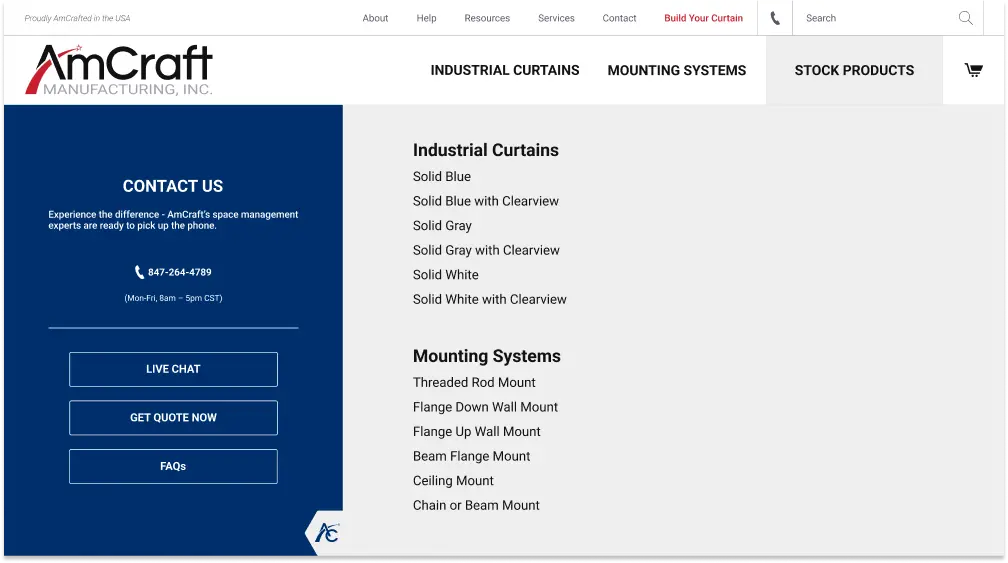
It was a collaborative decision to utilize a mega menu to effectively display categories I had organized in the sitemap. The three main categories being Industrial Curtains, Mounting Systems, and Shop Stock Products.

INDUSTRIAL CURTAINS
I organized /industrial-curtains in four main categories: single layer, acoustic, acoustic baffles, and thermal. This hierarchy was already somewhat established as it was their primary source of business.
MOUNTING SYSTEMS
I organized /mounting-systems in three main categories: retractable, stationary, and food grade. The concept of distinguishing the difference between retractable and stationary was a new organizational enhancement I brought forward. This small compartmentalization helped the end user understand and get to the solution they needed faster.
STOCK PRODUCTS
I wanted /stock-products to be a large call to action to allow the user the option to purchase a pre-cut stock item.
PRODUCT IDENTITY
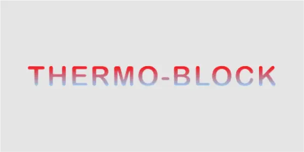
Enhanced the THERMO-BLOCK product line logo to a more professional and modern look using features from an existing matrix.
ILLUSTRATIONS
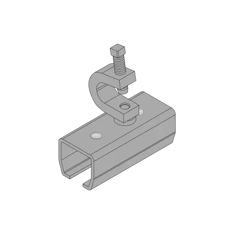
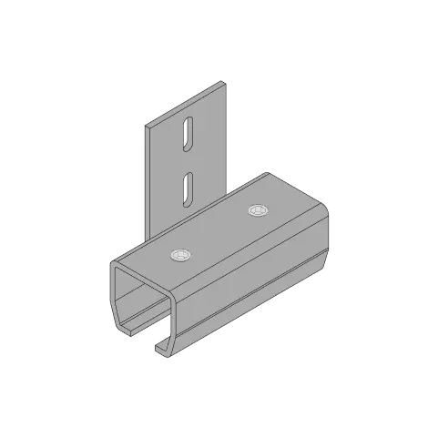
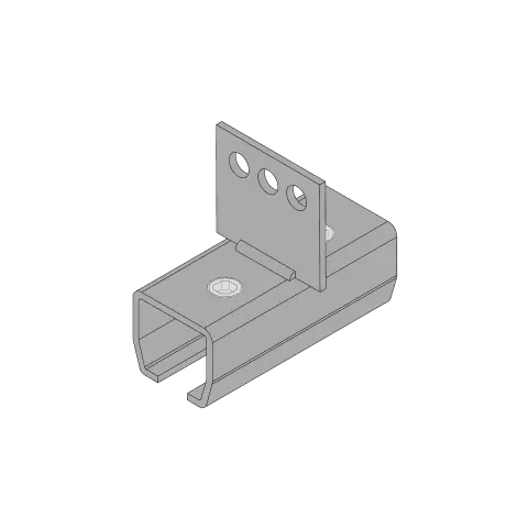
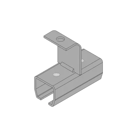
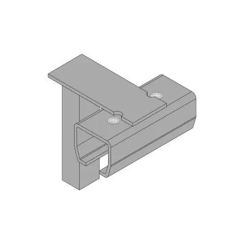
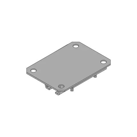
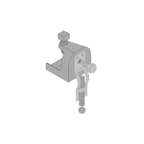
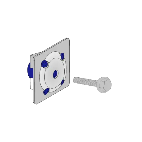
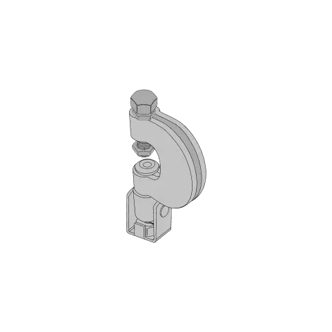
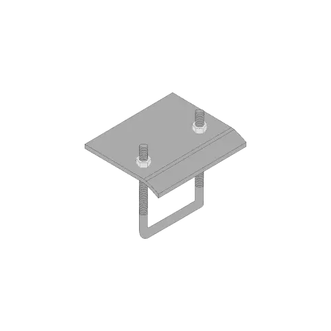
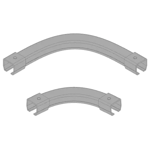
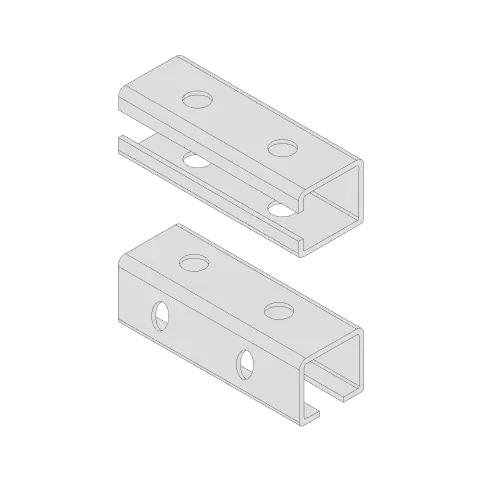
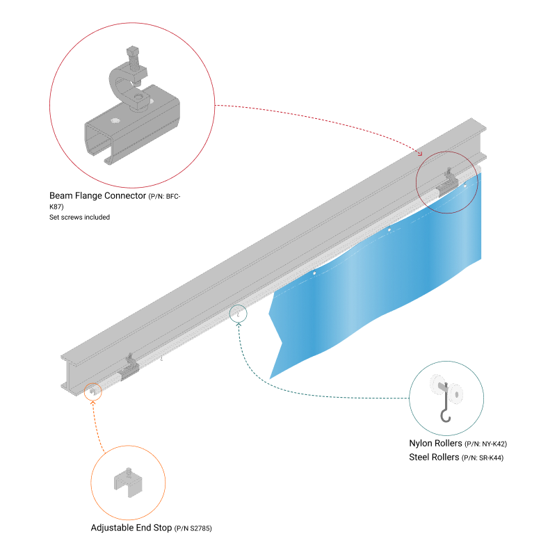
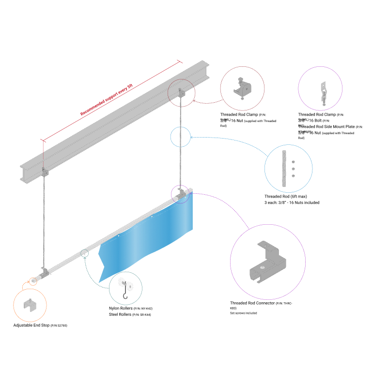
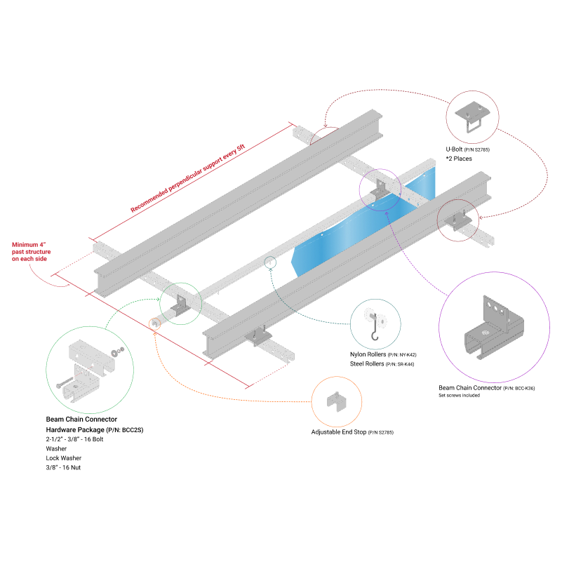
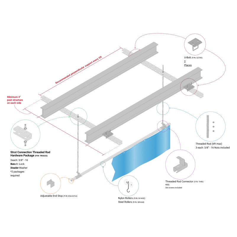
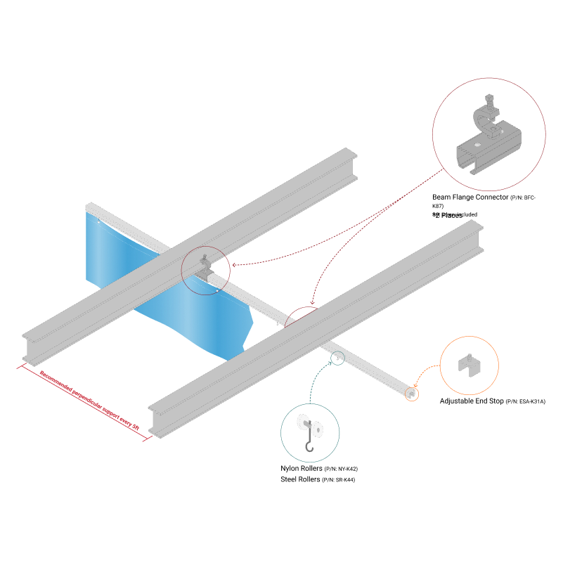
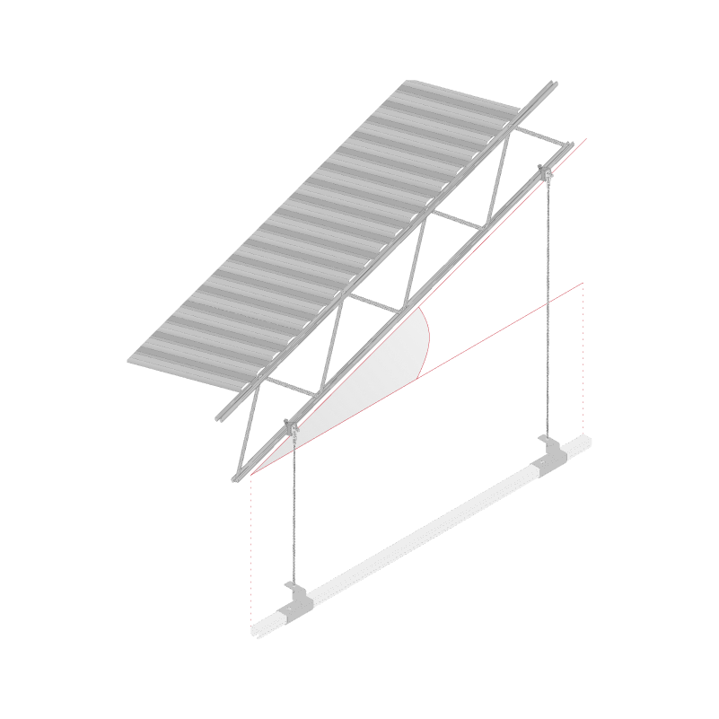
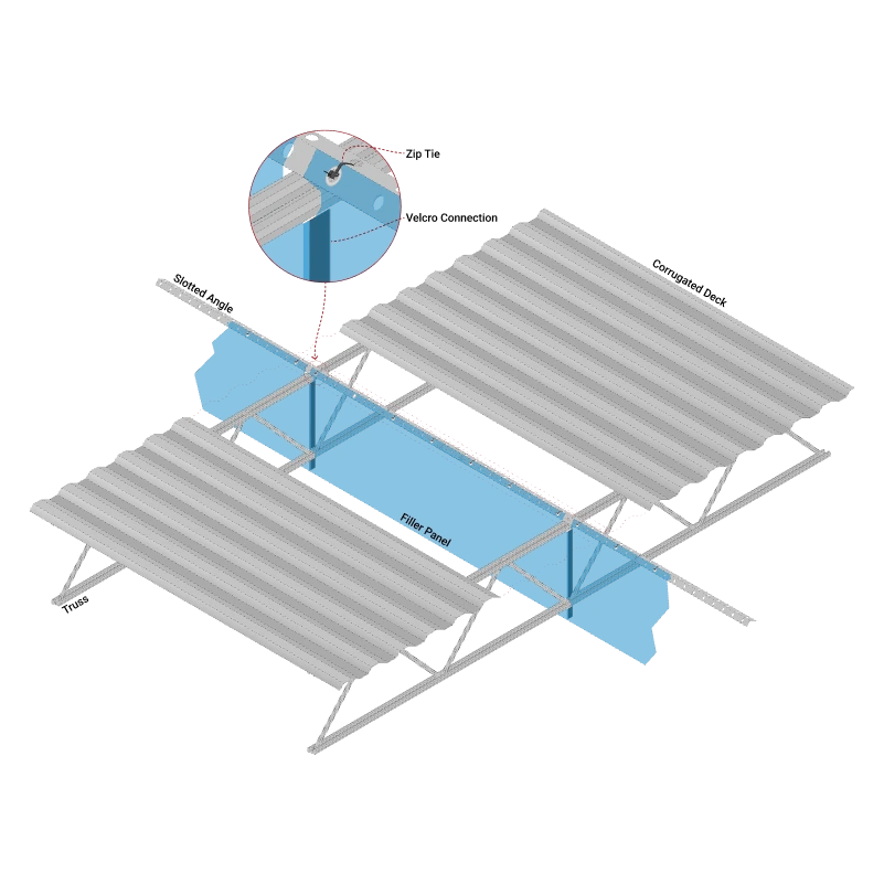
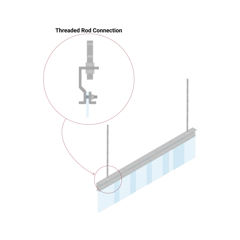
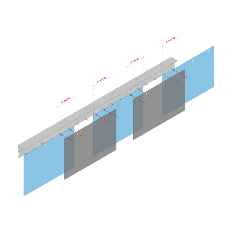
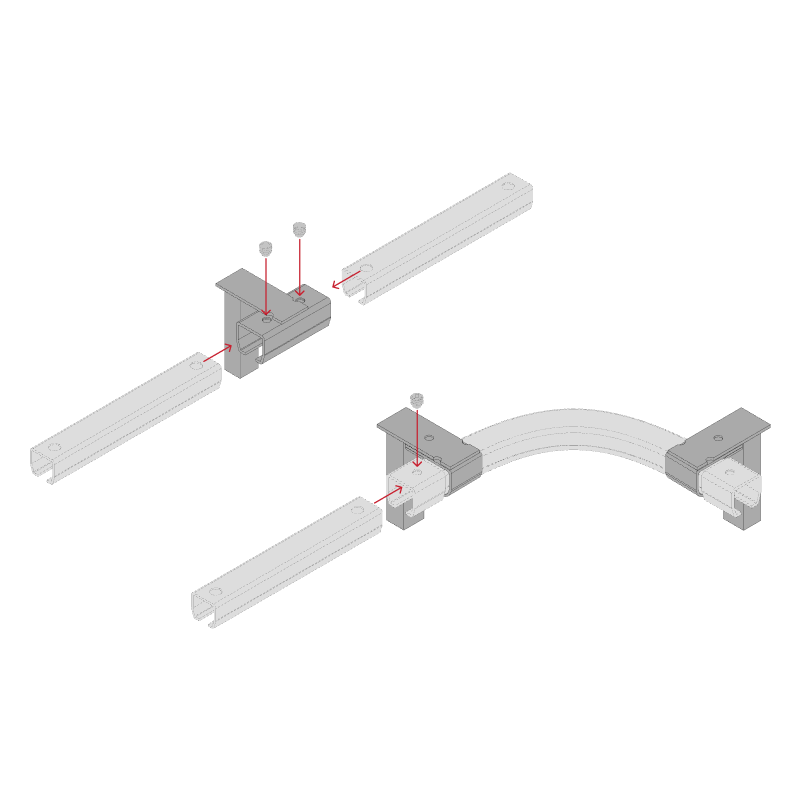
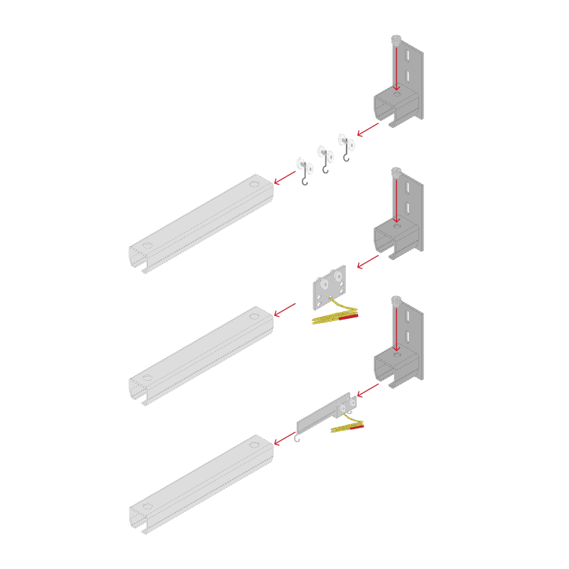
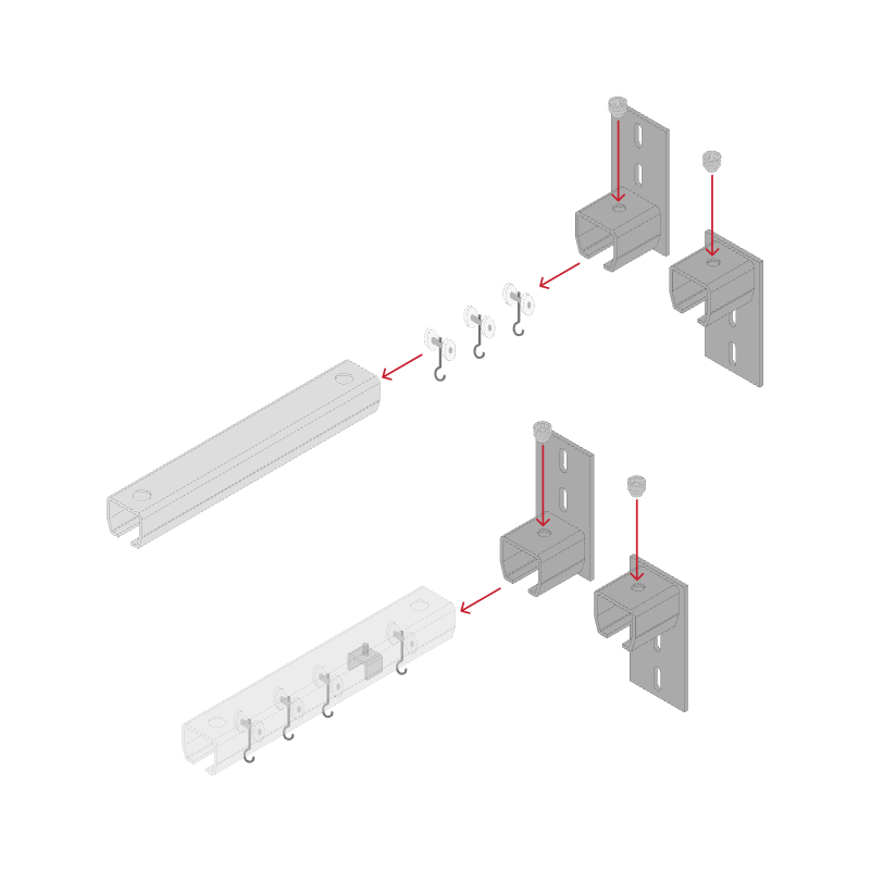
The concept of displaying finished products with CAD-like illustrations was scarce. I developed a library of vector graphic components, in Figma, based on a limited number of CAD drawings that had existed at that time. Below are a few of the many components created.
COMPONENTS
ASSEMBLED
TEMPLATES
MATERIAL SPEC SHEET
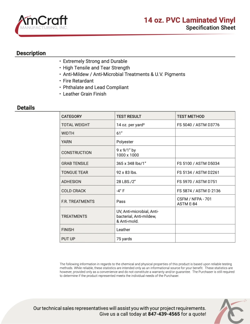
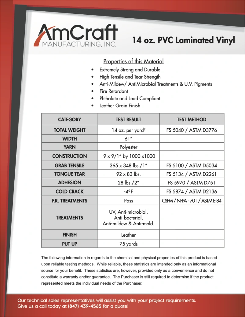
The original material specification sheet design felt crowded, cave-like, gave a sense of claustrophobia, and overall a bit too flashy for a sheet that is supposed to merely convey important data. I drew inspiration from 3M and Tesla specification sheets when designing the new template.
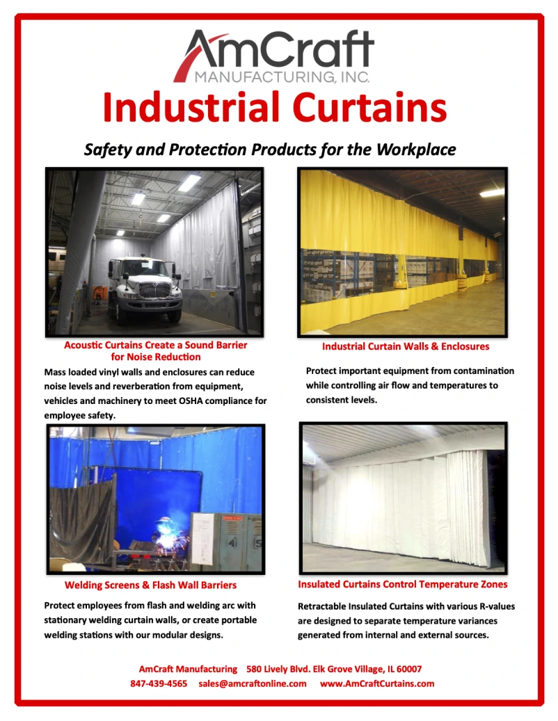
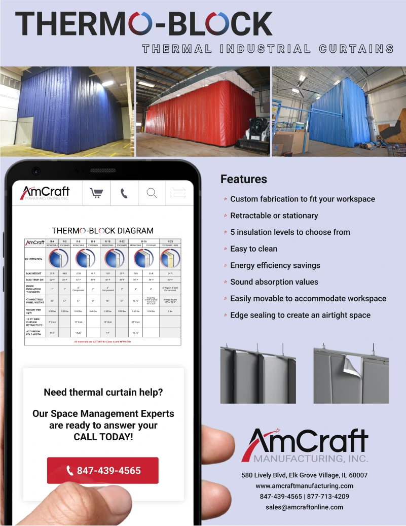
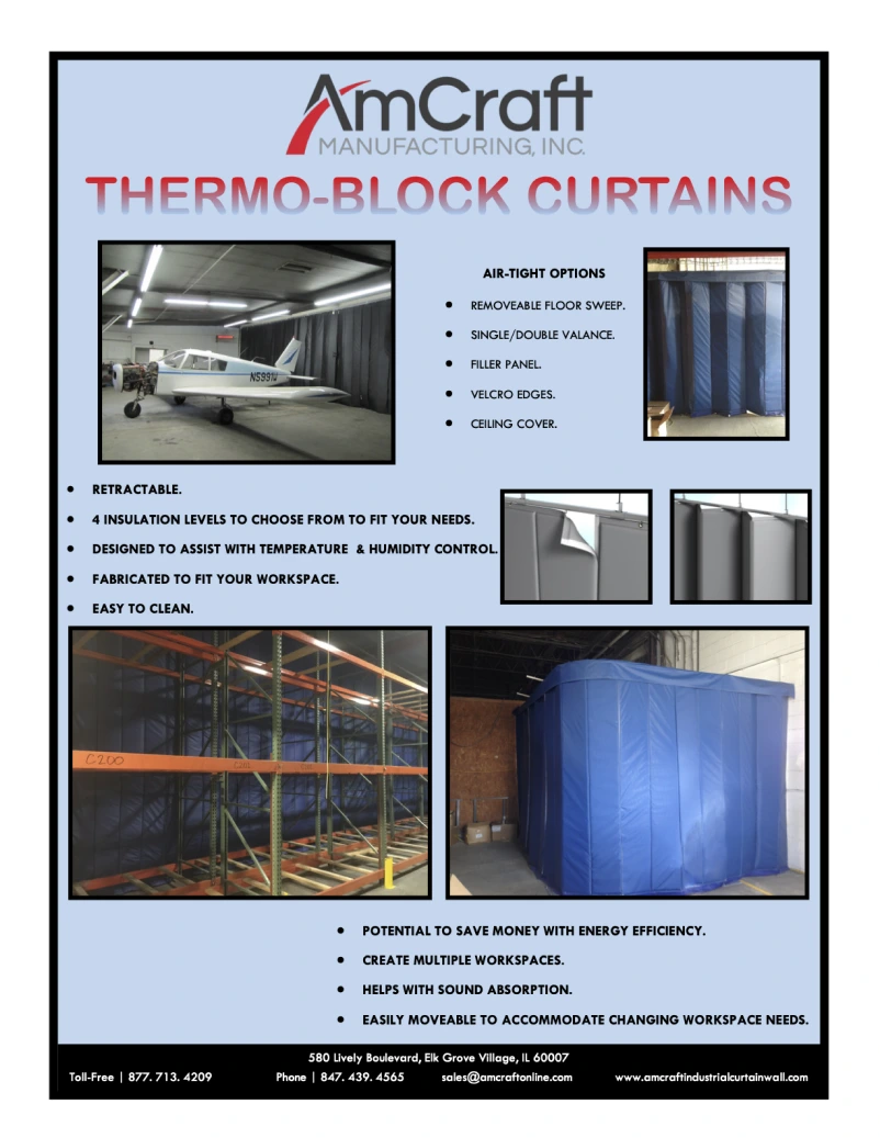
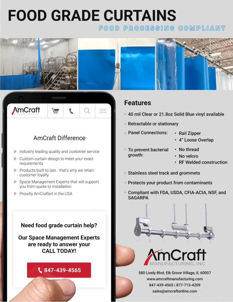
FLYERS
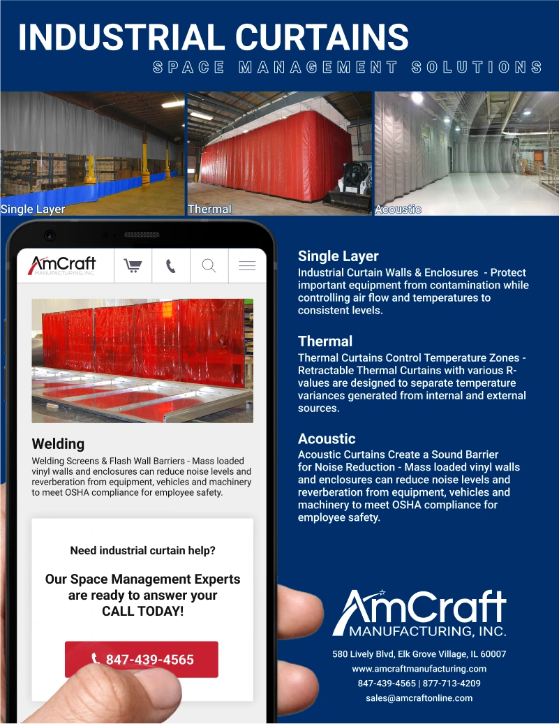
I was able to create a modern flyer template that could effectively and elegantly display the images/information required by stakeholders.
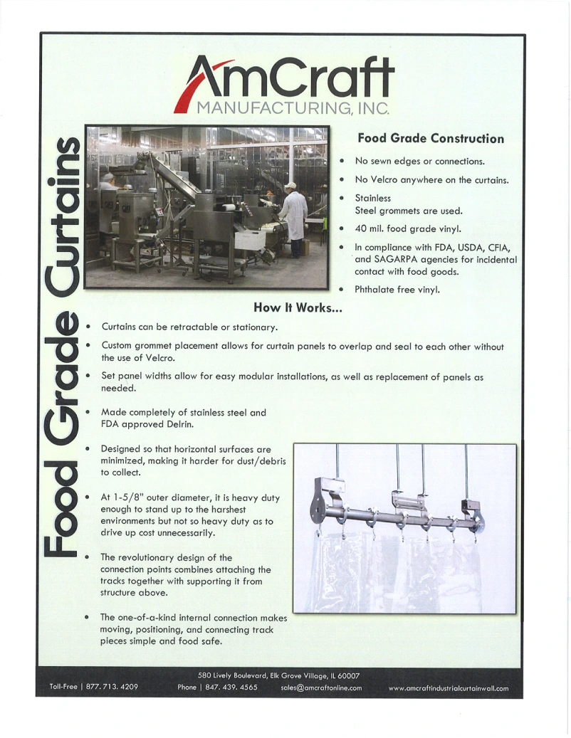
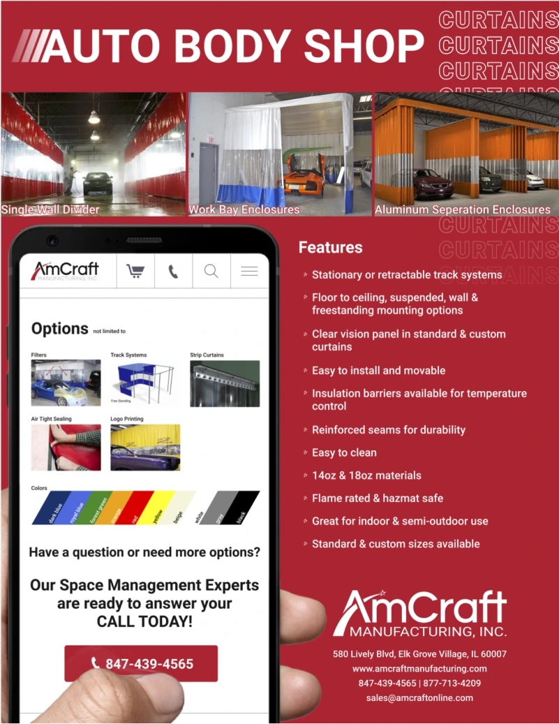
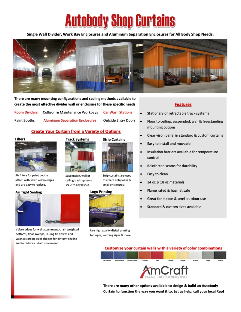
INSTALL INSTRUCTIONS
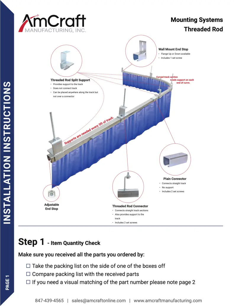
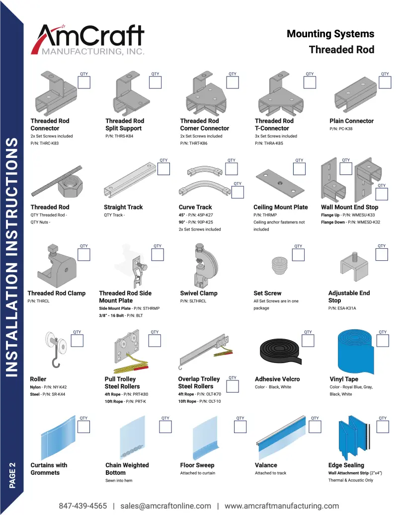
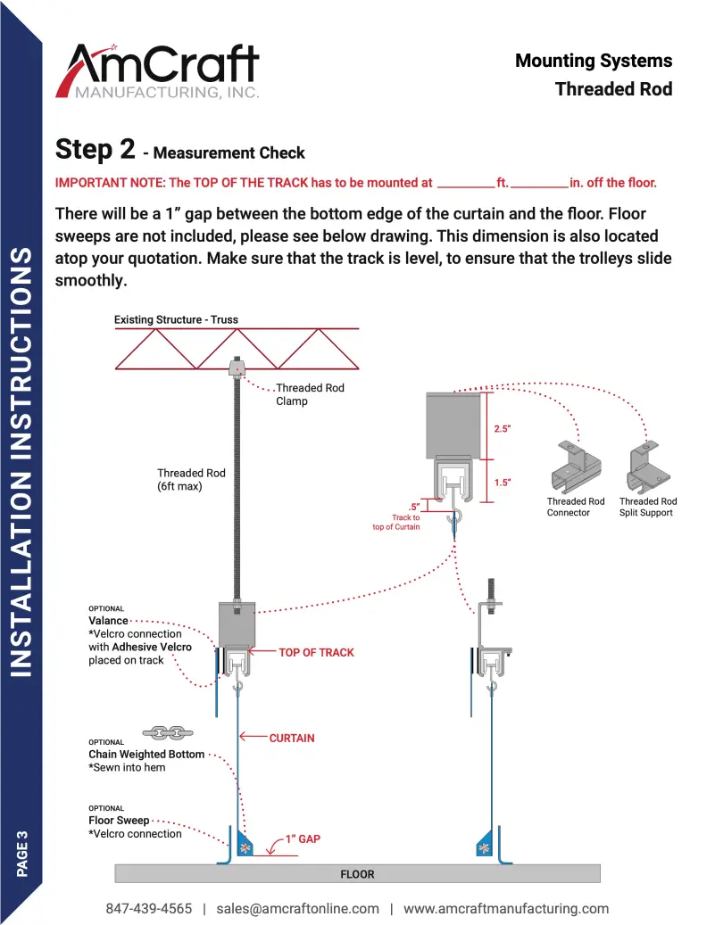
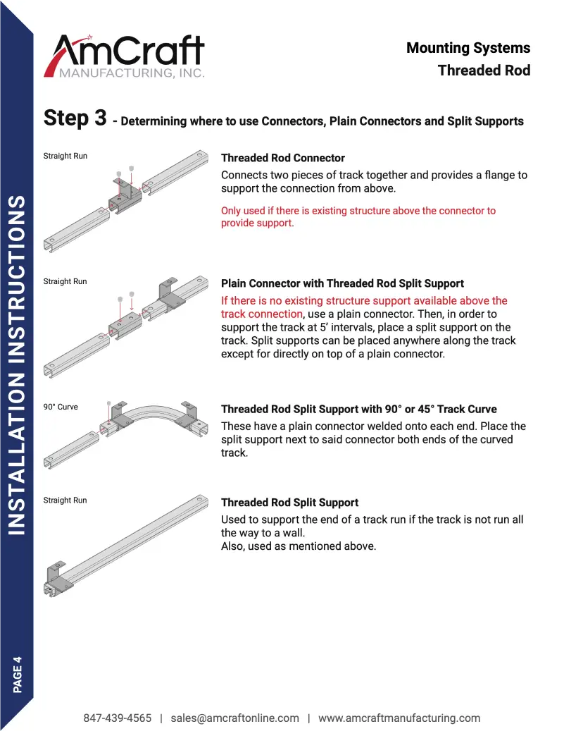
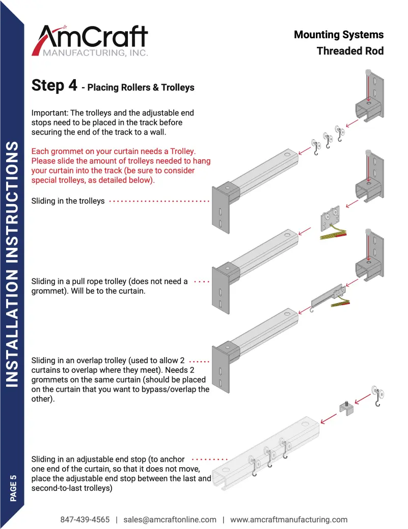
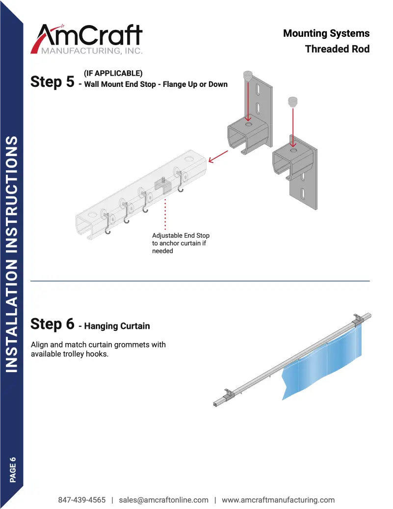
Complete revamp of installation instructions to effectively walk a users through how to properly install their purchased track system and curtain.
BEFORE
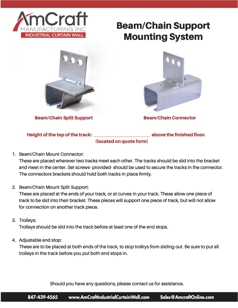
AFTER
PHOTOGRAPHY
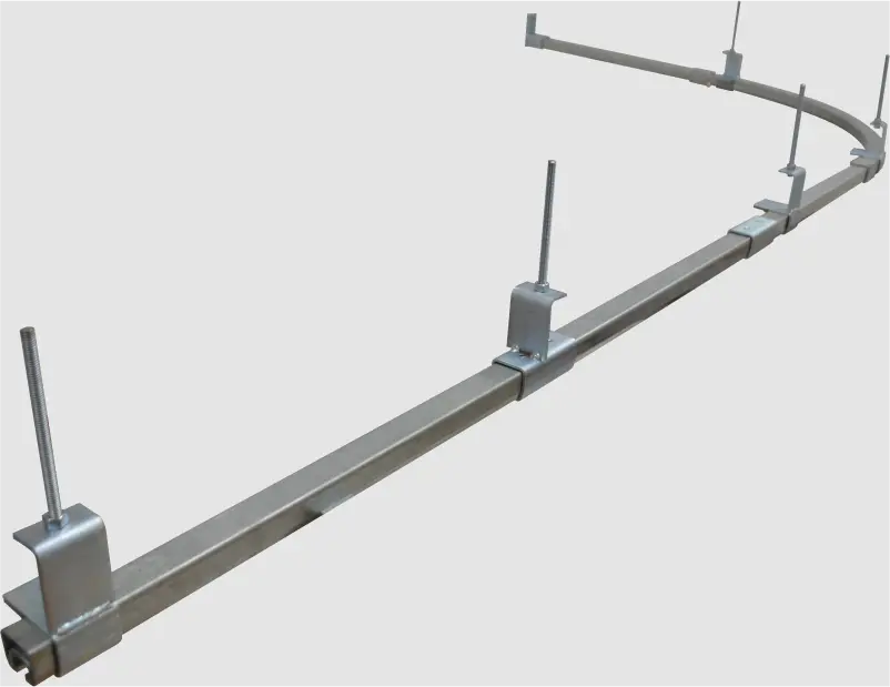
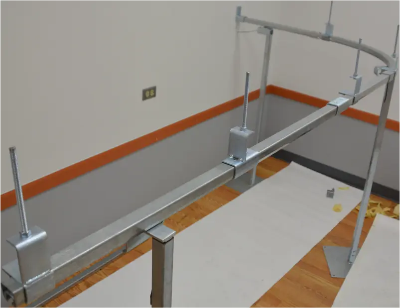
My mechanical background allowed for me to assemble real world miniature models with production components. These photos taken were then diligently traced, masked, and used in the install instructions.
